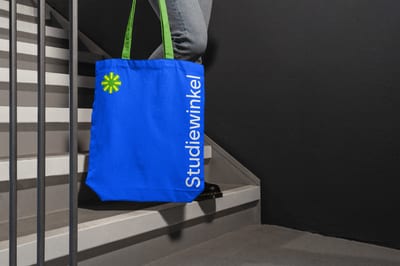
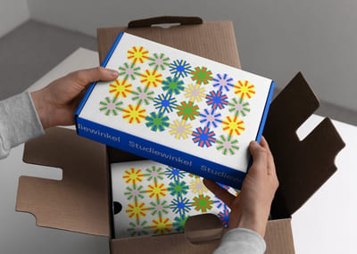
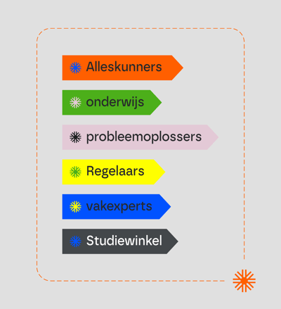
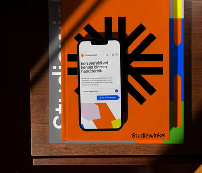
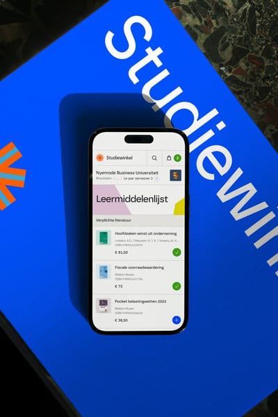
Studiewinkel
A unifying identity for a newly formed publishers alliance.
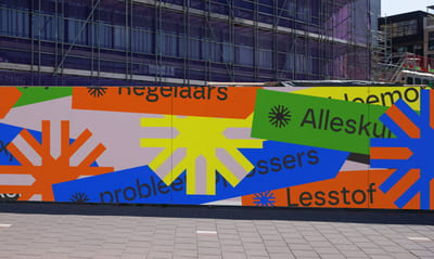
During an intensive three-month period, we supported a newly formed coalition of publishers. We developed a refreshing and bold brand aligned with their future ambitions and provided a comprehensive toolbox of design elements to accelerate all involved parties. Our efforts generated excitement and engagement around their mission, ensuring a cohesive and lasting identity to serve over 830,000 students and 46,000 teachers.